Link Text (H2)
Do not use same link text to link different pages or documents (H3)
Click here to check out our new Member Portal.
We have revised our small business plans – learn more!
Click here to Fina A Doctor.
When can you use same link text for multiple links? (H3)
Same link texts can be used when linking to the same unique page. For instance, a contact us link can be present in the header and footer of a webpage, provided, they both take the user to the same destination.
Use Descriptive Link Texts (H3)
Did you know we have a new Member Portal? Click here to check out our new Member Portal.
Our Small Business Plans have been revised. Click here to learn more about our new and revised small business plans.
New Tab (H2)
When to open links in new tab? (H3)
From an accessibility standpoint, it is best to open links on the same tab. Users always have the choice to open links in new tab if they need.
As a Neighborhood standard, we indicate external links to be opened in new tab.
Did you know we have a new Member Portal? Click here to check out our new Member Portal .
Formatting Text
Correct way to Bold Text
When making a text as “Bold” ensure <strong> tags are used instead of <b> tags.
Why is it important to avoid underlined text?
Often, underlined text has been placed on the page because the writer is trying to show emphasis or importance, however, this can be confusing to users because, the default styling for links in all browsers is that they are underlined. Thus, in an online environment, underlined text is generally used to indicate linked text.
Adding underlines to text that is not a link (because you want to emphasize it, for example) can confuse visitors to your website who expect anything with an underline to be a link. They may attempt to click on the text or may think that your website is broken. Reserving underlines for links rather than emphasis will help to ensure that your website behaves predictably for all users. This is useful for people of all abilities but is especially helpful for older or less web-savvy users, and people with cognitive disabilities.
Additionally, there have been studies done on how underlines impact readability both for average people and also for those with reading disabilities like dyslexia. Underlines, unless styled in a certain way, disrupt letters that extend below the baseline (letters such as p, q, y, and g) which can make it harder for people to read your text, especially if long phrases or sentences are underlined.
Source: Underlined Text – Equalize Digital
Alternates to Underline
- Write the word “Important” (or similar) before the content.
- Put the word “Important” in the alt text of an image.
- Include the importance in the
<title>, if appropriate. - Put the content in a heading, if appropriate.
When to use Italics?
Text in italics is generally more difficult to read. It can be especially problematic for people with dyslexia.
The intention is usually to emphasize a message — but if used excessively, it becomes harder for people to recognize the words.
Upload PDF and other Media Files
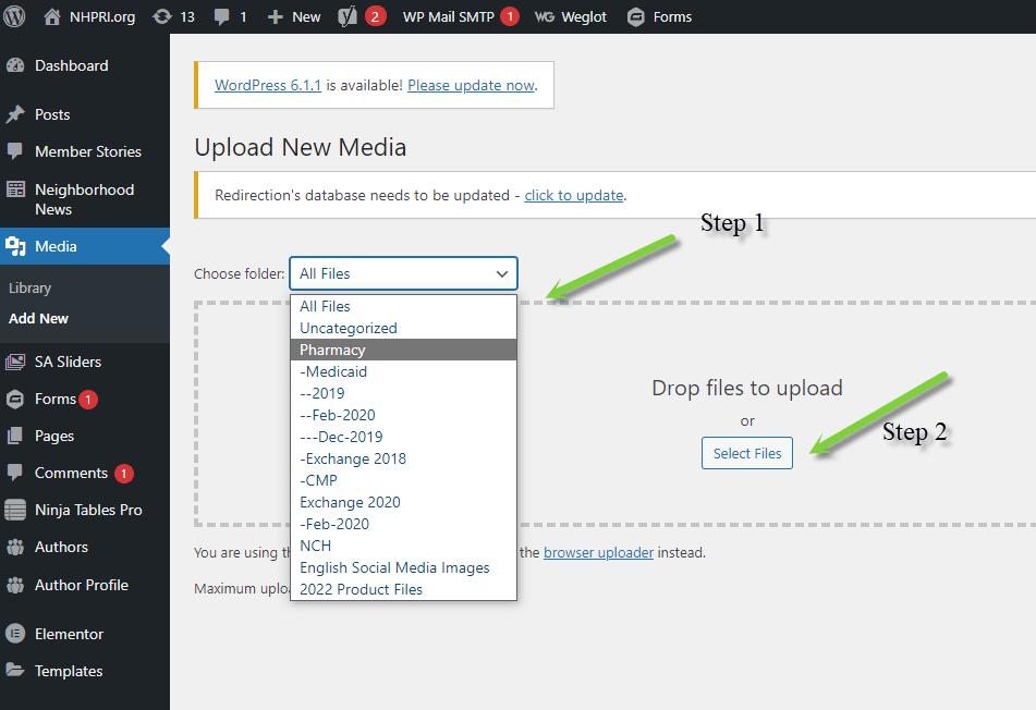
When uploading PDFs, try to upload them in an appropriate folder as indicated in the image below.
When uploading files, if it’s not necessary to keep the older version of the file, use the “Replace Media” option and replace the files instead of adding them as new files.
New Tab Shortcode
A link that opens in a new tab

A Spanish link that opens in a new tab

A link that opens in a new tab that has recently updated content

A Spanish link that opens in a new tab that has recently updated content

Doc Marker Shortcode
A Spanish document

A Spanish document that opens in a new tab

A Spanish document that has recently updated content and opens in a new tab
